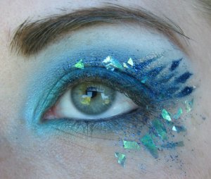
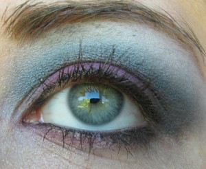
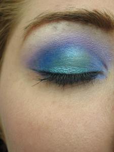
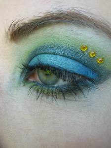
Today’s color is MAC Aquadisiac. On the surface it is a beautiful aquamarine, with faint silver flecks. Not frost, not shimmer, just…. flecks.
Pair with true blue’s to minimize the green, and have a slightly aqua sky blue in vibrant looks.
Blend with a harsh colored crease, and a contrasting colored highlight to soften
Over a grass green primer, it retains a good bit of intensity, with a bit more turquoise.
Over a true aqua primer, the shimmer takes center stage.
Over a slightly darker turquoise base, Aquadisiac can give a subtle depth and a blue sheen.


Oct 02, 2010 @ 04:27:55
aquadiac for me was highly disappointed in the texture. It was very “dry”, I was expecting a color like parrot (yeah right), shimmermoss, or steamy..but they already have those.. i need to give shimmermoss another chance and i’m going to do that right now, thanks for the suggestions.
Oct 02, 2010 @ 06:36:13
The dryness is what makes aquadisiac particularly effective for softening really deep crease tones, and blending over bright bases. On it’s own it’s definitely kind of a chore to deal with, but it can be more effective than more buttery, frosty, pearly colors, in those uses.
Oct 02, 2010 @ 08:12:28
i used aquadisiac tonight with a teal cream base and i liked it alot more, it brought the color out a lot. I actually used a teal cream base, then carbon e/s, then aquadisiac, it was really pretty and dramatic, kind of like an evil mermaid, thanks for the tips!
Oct 02, 2010 @ 16:01:21
Glad you liked it. I’d like to see pictures! I have Carbon, but I avoid using it whenever possible, unless it’s on the lower lashes.
I love MUFE Aqua Flash Cream, but most of my aqua shadows are dark enough that they alter the color, so Aquadisiac is beautiful for applying overtop to set, without significantly altering the color.
Oct 05, 2010 @ 07:42:10
heehee, i’m a carbon abuser. At first it scared me to death, now i don’t get scared, i just remember to use a teeny tiny amount and go from there. It is so pigmented and falls out easily its not the easiest shadow in the world to work with, but it is really useful once you get the hang of it.
Oct 05, 2010 @ 15:49:43
See, I just don’t like the way black shadow looks on my skin. I always reach for a slight-off black.
So I love DEEEP dark colors like UD frigid, goddess, MAC Beauty Marked, Sketch, rather than true blacks. Even REALLY deep grays like UD Gunsmoke or Creep(from the naked palette) I don’t care for.
Oct 06, 2010 @ 07:53:55
I was really disappointed in Beauty Marked. It is the perfect color bruise look for me though. I love sketch. It was in my first quad they made for me a long long time ago… sketch, contrast, tilt, and shroom, sounds odd, but it does make a really neat eye.
Oct 06, 2010 @ 15:48:00
Eh, I liked it. On my skin, it looks like a deep, shadowy contour, but it doesn’t have a bruiselike color. I use it sparingly, but but it has a touch of warmth. And it applies evenly, and easier than Carbon(for my skintype, anyways), without overwhelming. For along time my “standard” was to use Beauty Marked wet as eyeliner, and just faintly smudge it out a bit at the corners with a bit of it dry.
(my first four MAC colors were Greensmoke, Tempting, Satin taupe, and Honeylust)